Choosing interior paint colors for your home can seem like a daunting task, but it doesn’t have to be! Here’s the quick and easy way I did it.

How do I pick paint colors for my house’s interior?
Now, I’m sure that if you talked to a home design and décor expert, they would have a much more robust method for choosing interior paint colors for your home. They could probably tell you what the popular interior paint colors for your living room are or the best interior paint colors for 2023, but what if you don’t like those colors? Or what if you’re looking for colors that are true to your style and off the beaten path a bit?
Well, I’m glad you asked! While I don’t at all consider myself gifted in interior design, I do want my home to have character and be a place my family and I love to spend our time. Which is why I wrote down my top tips to help create a space you love using a coordinating paint color palette. Once I started implementing this simple method for choosing paint colors, I started to get plenty of compliments on the style and design of my home, even when it’s not a natural strength of mine. Basically, if I can do this, you can too!
So if you’re like me (not an expert) but want to create a welcoming environment in your home that is consistent and well thought out, keep reading! I’m about to take you step-by-step through my process. So let’s get started!
Tips for how to choose interior paint colors for your home:
Tip #1: Select a neutral base color.
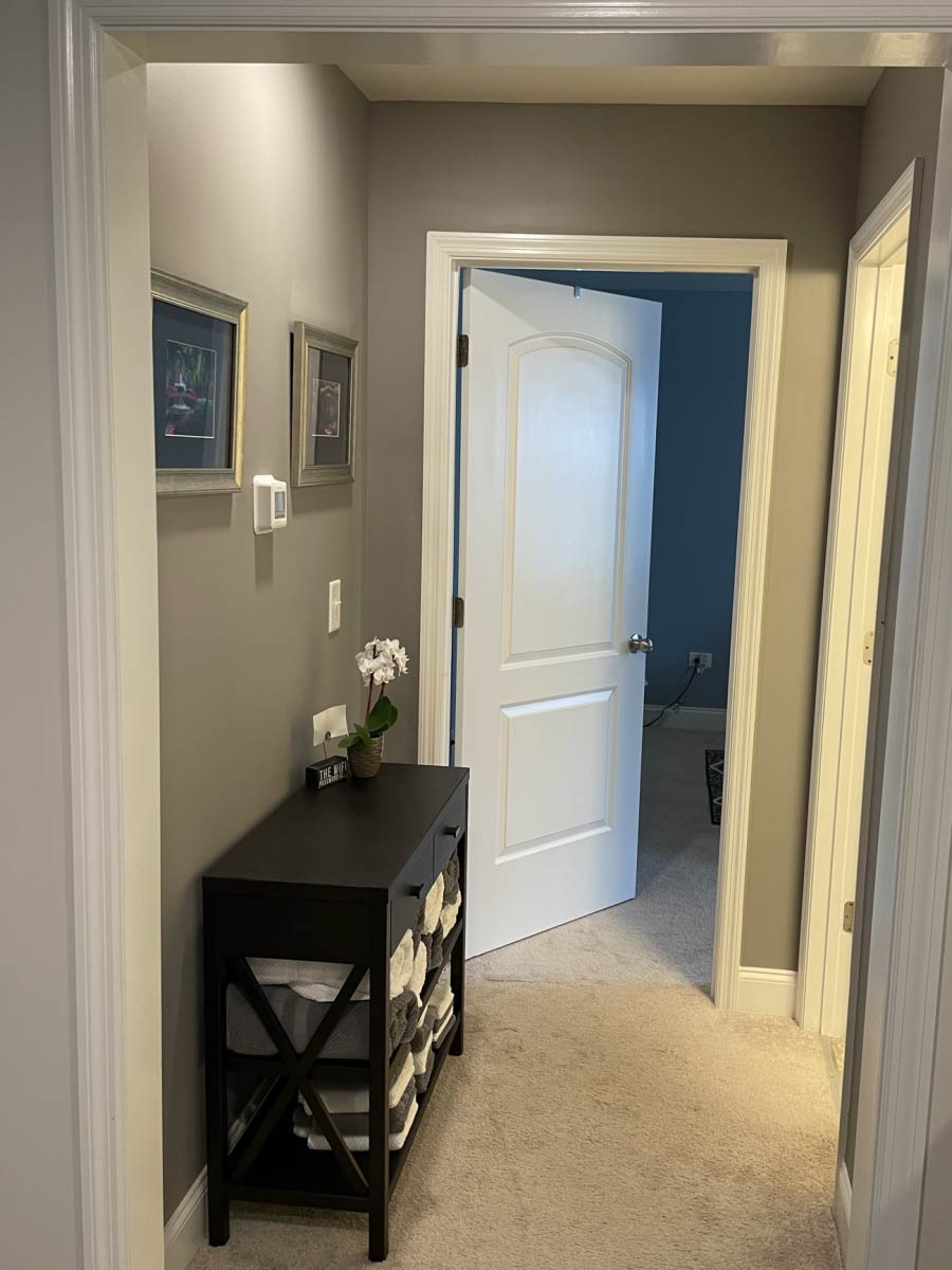
Start by choosing a neutral base color that you love and goes with much of your natural style preference. For me, this was a warm medium gray color called “Fashion Gray” by Behr.
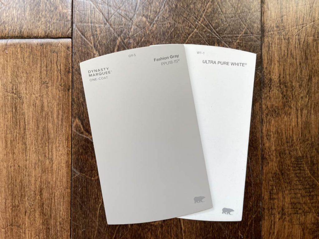
I chose this color because our home is largely open concept with higher ceilings and many large windows. This architectural style results in spaces feeling larger, light, and airy. It also allows me to use colors that are a tad on the darker side without making the space feel small or closed in.
This neutral color should be one that will look good with most other colors on your completed color palette. It’s a great way to pull another color into a room to add depth and dimension. Maybe you use this color on the guest room vanity, or to paint the nightstands that need a fresh coat. Because this is your main neutral base color, you’ve probably already used it for the kitchen island, the living room walls, or the interior doors. By using the same color in multiple areas of your home, you create consistency and connection between rooms.
Tip #2: Grab a white paint chip.
When choosing between colors, especially lighter colors, they can tend to all blend together. A trick to be able to see the true tint, place a bright white paint chip next to them. This helps to bring out the real undertones of the colors.
Also, most trim is white, so this also gives you a great idea how your interior paint colors will look up against the trim.

Tip #3: Choose 2-3 main interior paint colors.
Because these are your main color, these should be the colors you want to see most in your home. Think: the common areas, the doors, trim, etc. Many newer homes with have just one color all throughout the house, so this is a great opportunity to add color and character wherever possible.
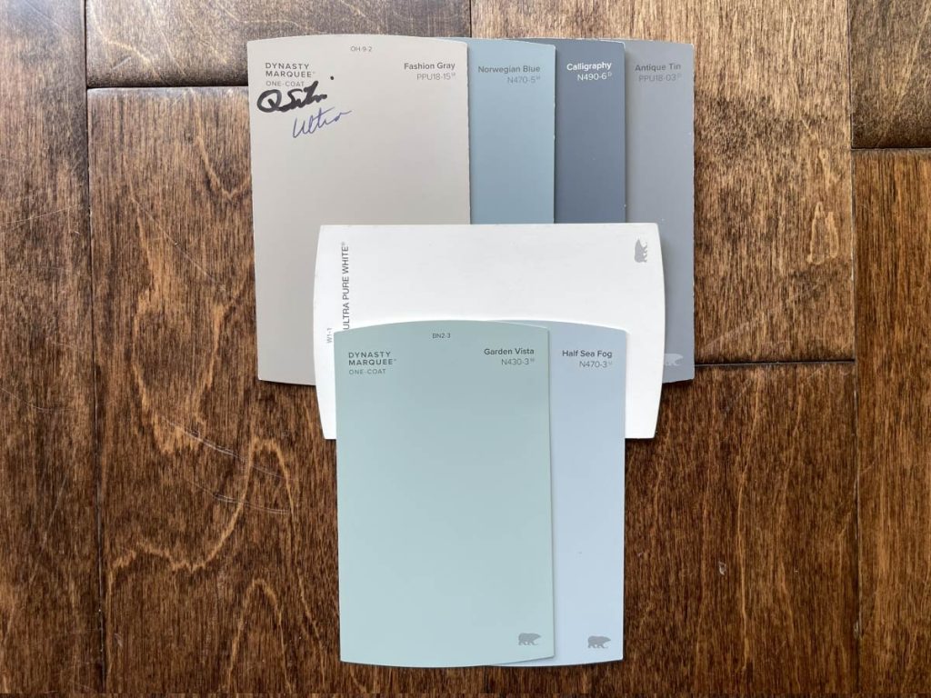
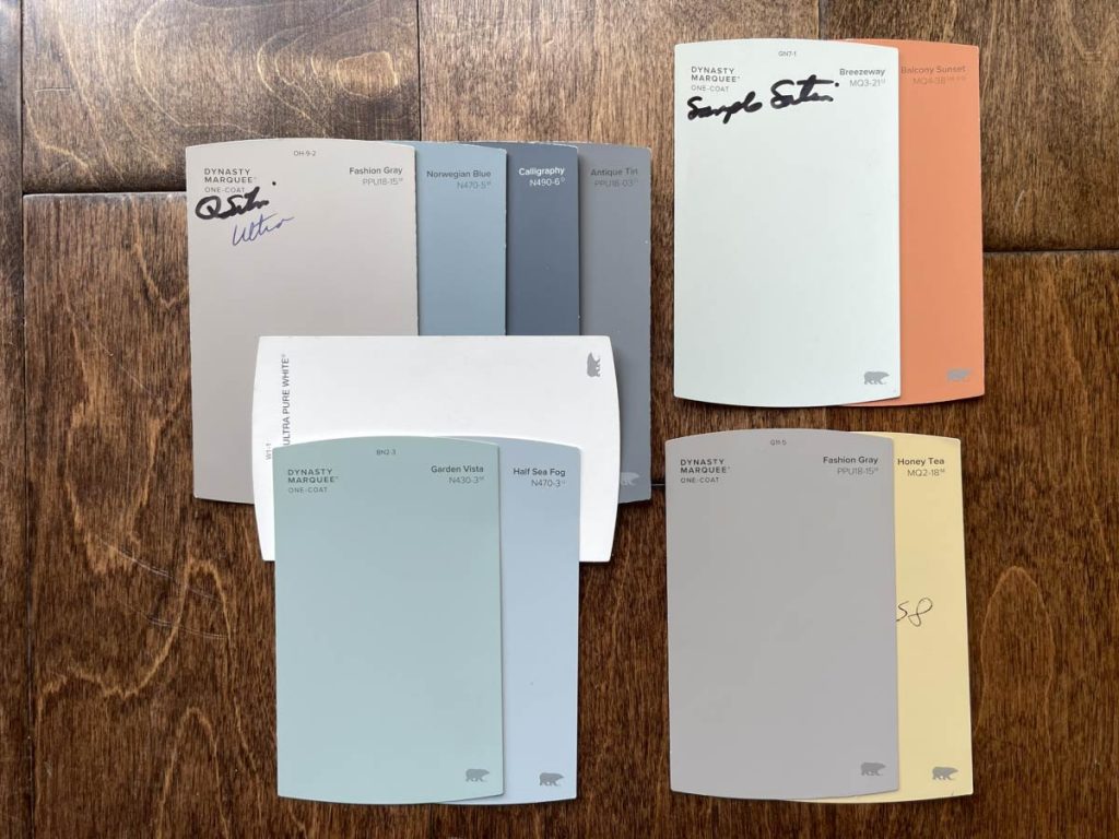
I chose 3 shades in the blue family: Norwegian Blue, Calligraphy, and Antique Tin. I love how these colors look next to each other and throughout our home. I used Calligraphy in our entryway and Norwegian Blue in 2 shorter hallways off our main living areas.
The Antique Tin is what I plan to use for the interior doors. This seems like quite a big project, so I’ve been putting it off until I have a bigger chunk of time. Have you painted interior doors in your home? Let me know in the comments if you have any tips for me!

Other articles you might enjoy:


Tip #4: Choose 2-3 supporting actors.
By pulling a few other colors into your palette that are similar to your main colors, you’re adding dimension without busyness or confusion.
Because I knew I wanted to paint a few rooms on the west side of the house, I grabbed a couple lighter colors that still compliment my original darker blue/gray palette. These lighter colors are Garden Vista and Half Sea Fog.
Tip #5: Leave room for additional accents per room.
I love using brighter colors throughout the house to add in character and visual interest. These are great for wall stencil projects, furniture updates, and even an accent wall in a child’s room.
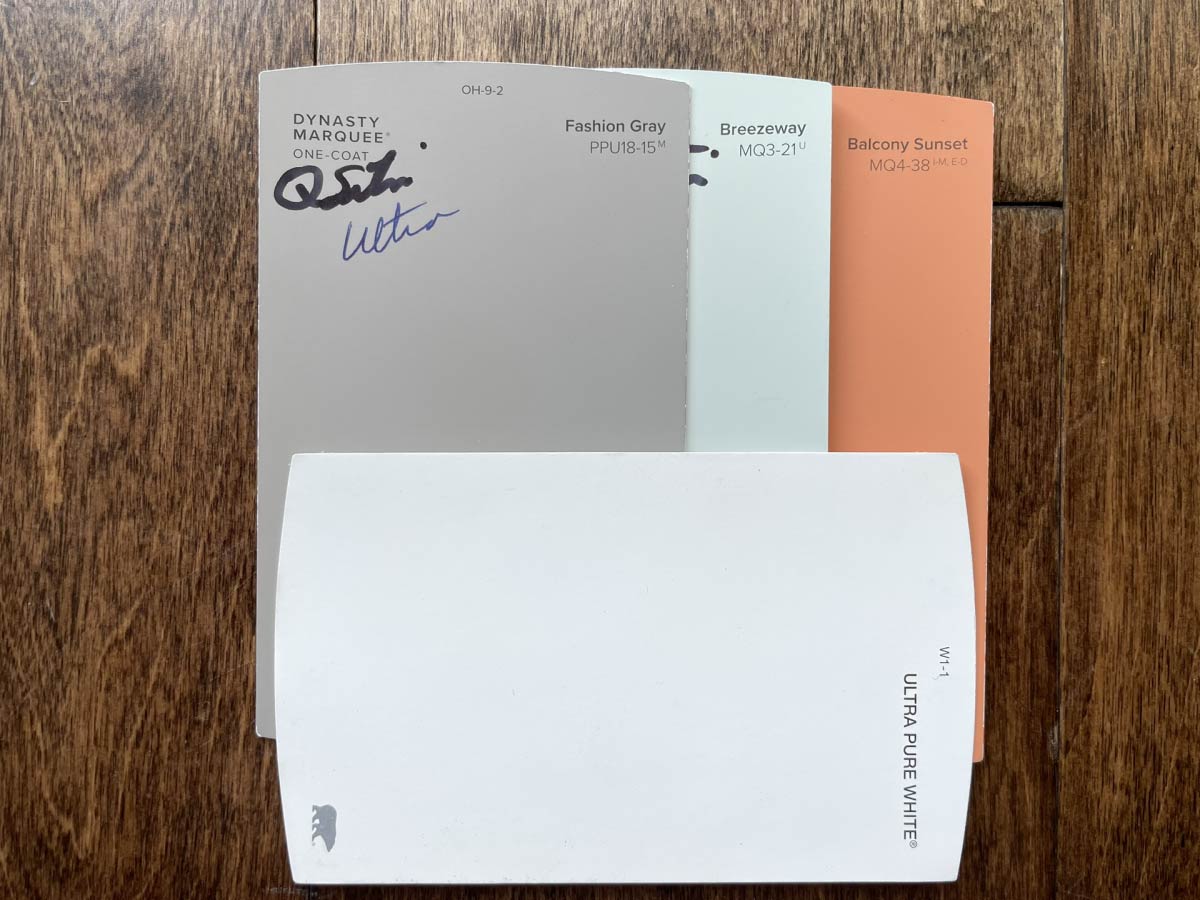
I used Breezeway, Balcony Sunset, and Fashion Gray in the downstairs bathroom on a cute stencil project. My daughter loves orange and wanted the whole room painted this color, but the stencil was a good compromise for us all.
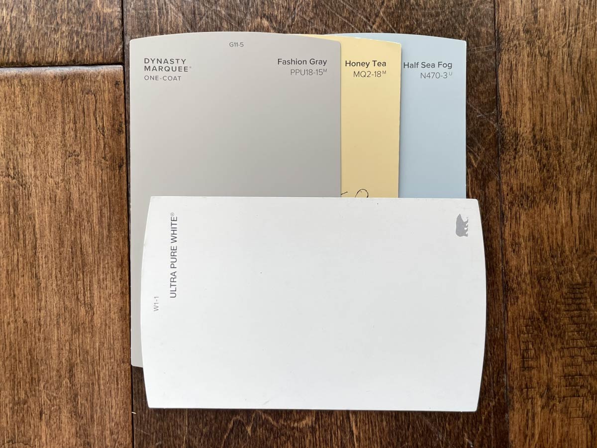
I used Half Sea Fog in our guest bedroom and Honey Tea, Fashion Gray, and Half Sea Fog in the adjacent guest bathroom.
By using the Fashion Gray in all the rooms, and repeating the Half Sea Fog in multiple rooms, I’m easily continuing the color connections across my entire home, without making everything look monochrome.
Tip #6: Check the time
Be sure to view interior paint color choices in the space you will be painting at different times throughout the day. As the sunlight changes, the color will appear differently too. You may find the paint color you loved as a paint chip, actually won’t work at all in the space you’re working on. Better to know that before you get the whole room painted!

Tip #7: Layout entire interior paint color palette.
This is probably my favorite part of the whole process. It allows me to see the interior paint colors for my whole house at one glance. I can make changes or adjustments as needed. It’s also really fun to pull different color combinations together to get ideas for new painting projects.
As long as all your colors looks nice when grouped together, your home will look connected from room to room. This is a great way to avoid that one room you walk into and think “What was I thinking?!” (Not that any of us have ever done that.)
Bonus Tip: Keep a list!
One last quick tip: Keep a master list of all paint colors (and finishes!) along with coordinating locations they’ve been used throughout your home. This is super helpful for you to reference as you take on more projects throughout your home. It’s also an amazing tool to pass on to the next owner of your home, should you plan to sell in the future.
FAQ’s
What are the most popular wall color paint?
Sherwin Williams named Evergreen Fog their 2022 color of the year. It is a very pretty lighter mossy green color that is similar to the Garden Vista color shown in the photos above, but slightly more gray. It’s very agreeable with tons of other complimentary colors.
In general, earth tones and neutrals are still holding strong in the top spots. But this still doesn’t answer the question as to what colors are right for YOUR home. That’s going to be something that only you can answer. Hopefully, this article has given you a great game plan to find those perfect colors, in a simple and easy method.
What is your favorite neutral wall paint color?
A few years back, everyone started covering up their warm beige walls with some shade of cooler gray. Then everything turned neutral and white washed…..I mean EVERYTHING. (Can a girl get some color please?!?) Now, we’re seeing muted colors and earth tones start to sneak in everywhere. As a result, the white top cabinets are being paired with the darker gray bottoms. The navy build-ins in the living room….color really is coming back.
So when we talk about my favorite neutral wall color or the “best” neutral wall color, my advice is to also think about the other colors you want to incorporate into your home and work backwards from there. Find neutrals that compliment your color palette and can bring connection through your whole home.
For me, my two favorite neutral wall paint colors are Fashion Gray and Toasty Gray, both by Behr.
What color should I paint my living space to promote serenity?
Cooler colors are going to promote chillness. (Get it?) Muted darker greens, deep rich navies, and of course your neutral grays are what you’re looking for here. All those colors are going to promote relaxation in the best way.
What paint colors compliment each other?
This is what I love about Tip #7 above! As a result, you get to see all your color selections together on one pallet and see how they coordinate with each other. This is a great time to make edits and adjust your interior paint colors to best suit your taste and coordinate with each other.
That’s it! Those are my 7 simple steps to help you choose interior paint colors for your home. I hope you’ve found them helpful! If you have any others to add to this list, be sure to comment below and let me know!
As always, if you use any of these tips, I’d love to see your process! Be sure to tag me on Instagram
@leedsstreetcollective with your photos.
Thanks so much for checking out the Collective!
– Sarah


We bought our dream house a few weeks ago, and we’re ready to start decorating it, so my fiance and I are interested in choosing new paint for it. We’re glad you talked about checking your paint color shade at different times since light changes how we perceive colors, so we’ll definitely keep this in mind when we visit a paint shop next weekend.
Congratulations, what an exciting time! Painting the interior of your home is one of the best (and most affordable!) ways to make a house a home. Best of luck with color selections and painting!
Great post! Choosing interior paint colors can be a daunting task, but there are several tips that can help simplify the process. First, it’s important to consider the purpose of the room and the mood or feeling you want to create. Second, taking into account the existing decor and furnishings can help ensure the colors selected complement the space. Third, testing paint samples in the actual space and under different lighting conditions is crucial to ensure the color looks the way you want it to. Fourth, selecting a cohesive color scheme throughout the home can help create a unified and harmonious design. Finally, considering the sheen and durability of the paint can help ensure the longevity of the finish. By following these tips, homeowners can feel confident in their interior paint color selections and create a beautiful and functional living space.